Monday, October 31, 2011

Love it / Live it: Manic Malachite [Aili Schmeltz]


Happy Monday readers! I apologize for the lack of posts last week, I'm a bit buried in work right now but I just couldn't stand to stay away any longer. Blogging inspires me and is always a great way to rejuvenate and refocus when things are getting out of control for me. One artist in particular that has been on my radar and motivating me to create is Aili Schmeltz. Her mixed media works both flat and sculptural play with spacial boundaries in such an intriguing way...


 I just can't get enough of these acid bright greens right now. It's nature's palette with the volume turned way up, not to mention that green is a color of female empowerment. And this rug is blowing my mind. Believe it or not, it is made out of FELT. That's right, the crafting geniuses over at Martha Stewart have done it again. I'm thinking a spin on this idea might be a wonderful addition to my bedroom wall...now if only I could get some extra hours in the day...Enjoy!

Wednesday, October 26, 2011

Art + Interiors: Tonal Blocking [Liz Maxwell]

Two looks that have been high on my radar this year are color blocking and dip-dying. So you can imagine my excitement when I found an artist, Liz Maxwell, whose work combines both looks in tonal shades of blue and green. As subtle as each composition is, there is a strong sense of horizon in each piece, making them incredibly calming and peaceful...


from top pillow via Xavier & Me, mug via Terrain, rug via Abc Carpet, Vases via Anthropologie, pillow via Belrossa Home, lamp via Abc Home

The same way that gazing at the horizon can settle and ground us, pulling in soft horizontal lines into the home can have the same effect on your space. And bolder hued color blocked pieces add in a modern touch. I'm thankful everyday when I get to sea the sun go down over the horizon, it tends to have a way of bringing me back to earth when I'm getting lost in my own head...Enjoy!

Monday, October 24, 2011

So I've been pinning...

And I must say I am a bit addicted. I'll admit it took me a while to jump on the bandwagon, I was worried that if I joined Pinterest it would just be one more thing to keep track of, but on the contrary I can't seem to get enough of it. It is a great resource for products, ideas and just general inspiration. And browsing through other creatives' mood boards is a feast for the eyes. So here is a little peek at what I've been pinning...
So if you want to get in on the fun, join here and let me know where I can find your boards and for an extra dose of daily inspiration from me, follow my pins here- and we'll keep spreading the love for life around...Enjoy! 

Thursday, October 20, 2011

Neon Daylight

I know when most people think of Fall, they think reds and oranges, but I'm in love with the moment right before that, when the leaves turn the brightest shade of yellow-green you've ever seen. And on a misty Seattle morning, the neon leaves seem to glow against the grey sky...


So now I'm looking for ways to channel this look into my home and wardrobe as well. A painting like Paul Behnke's minimalist neon and blue work would be like having a patch of September sunlight on the wall year round, and this little purse I've seen floating around the web would add a shock of interest to any bundled up outfit. Hope your Fall is off to a bright and shockingly wonderful start...Enjoy!!

Wednesday, October 19, 2011

The Beauty of the Brush Stroke: Franz Kline + James Nares + Kelly Wearstler

The brush stroke is generally used as a tool, one of many components that makes up a composition. But many artists have embraced the brush stroke itself as a work of art. One of the pioneers of this way of thinking was abstract expressionist, 
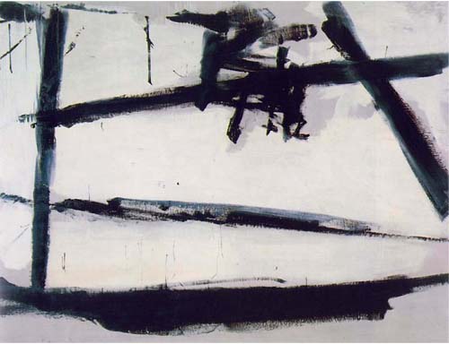
Franz Kline, who's black and white compositions use bold and brash brush strokes to express structure and space...


Today, contemporary artist 
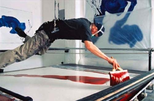
James Nares is exploring the spontaneous elements of single strokes of paint, positioning himself and his over sized paint brush above the canvas horizontally, letting gravity and force dictate much of the outcome...


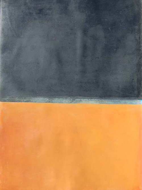
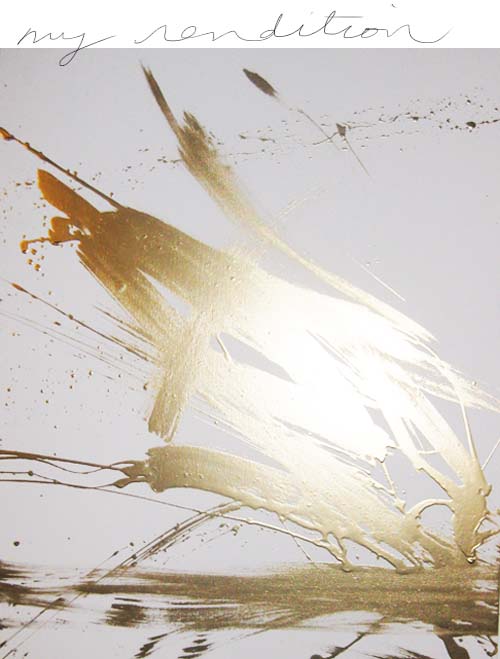
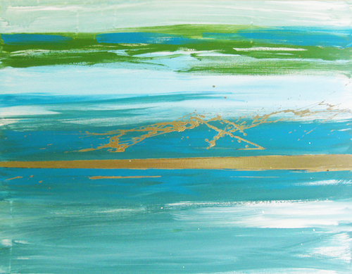
I can't help but love the organic tonal variations and the way the paint seems to dance across the canvas in each piece. And I especially adore the element of spontaneity in his work. There is something so incredibly intriguing when an artist releases some of that control and embraces the results. I find this approach to be incredibly freeing and some of my favorite paintings have been the most unplanned and uninhibited, like this gold piece that now hangs in our bedroom...(please excuse the horrible photography)


Interior designer-gone-fashion designer (and my personal hero) Kelly Wearstler uses this look brilliantly in her new collection. And her chiffon and silk fabrics flow just as beautifully as paint on a canvas, making the entire look feel effortlessly chic. I have fallen head over heals for the turquoise mini of course...

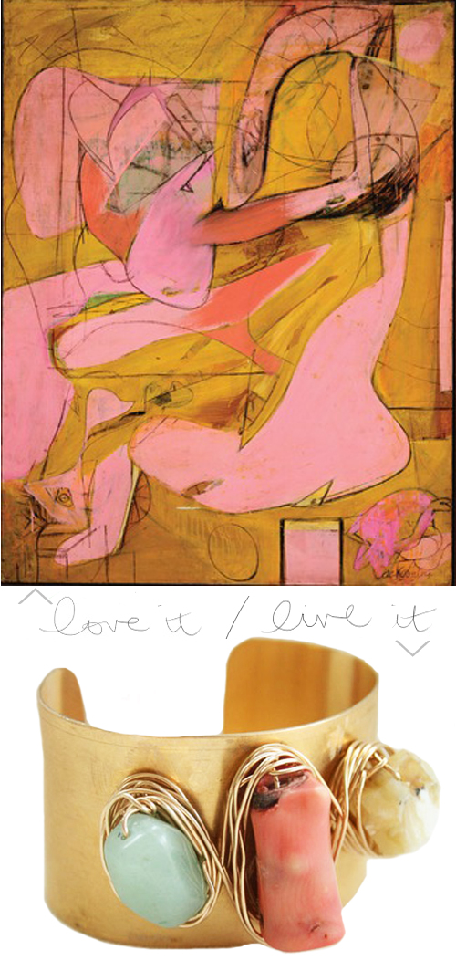
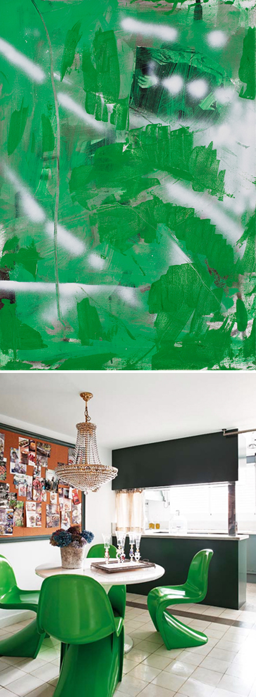
And I am always looking for ways to incorporate this look into my home. I love the relaxed urban feel it brings to a space. Like Franz Kline and James Nares' paintings, each piece has a unique story that is made by the viewer rather than the creator, allowing guests and homeowners alike an unassuming sense of comfort when entering the room.

lamp via Beeline Home, plates via Elephant Ceramics, Pillow via Belrossa Home, Rug via Fort Street Studio, Glassware via Habitat, plates via Elephant Ceramics

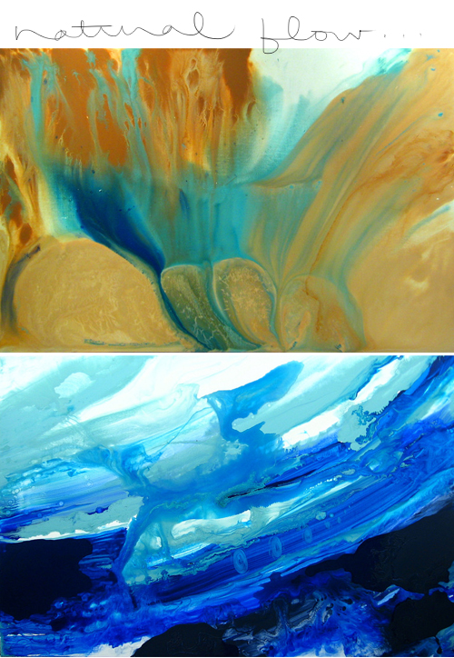
In fact, looking around right now I see a few glaringly blank palettes in my own home that could use this treatment. Afterall, Miss Wearstler treated a whole wall this way so why not? I strongly urge all of you to try it too, it can be incredibly freeing and you never know what kind of beauty that may come from it...Enjoy!!


Monday, October 17, 2011

Orange Crushed: Amanda's Manhattan Apartment

Hello!! I haven't even unpacked my bags yet from my whirlwind trip to NYC but I just could not stay away any longer. I got the pleasure of spending some time with an old friend and fellow blogger while in Manhattan and like many of my friends, she wanted my two cents on how to make her living space special. Many of us 20-somethings are renting rooms and aren't able to tear down walls and refinish surfaces to make a space our own, sometimes the paint color isn't even in our control. Such is the case for Amanda, who is sub-letting a charming little orange room near the East Village...
Don't get me wrong, orange is a wonderful statement hue and has actually been proven to be the happiest color of them all, but it definitely presents a challenge when creating a space that will also be calming and peaceful. So I pulled together a look for Amanda that would mesh with the vibrant walls without being too overwhelming, mixing bold accents with textured whites and greys for a little Moroccan getaway fit for a vibrant and vivacious girl about town...
Lanterns via World Market, pillow via Madeline Weinrib, screen and vases via Z Gallerie, pillow via John Robshaw, duvet via Dwell Studio, End table via Wisteria

Turquoise sits right across from bright orange on the color wheel, making it a complimentary hue, so pulling it in through some key accents helps to balance out the color in the room and take the volume down a notch. And putting a large screen behind her bed will bring some texture and dimension to the room without taking up any precious real estate. Best of all, any of these pieces will fit seamlessly into whatever color or type of space she lands in next!

Hope you all had a wonderful weekend, I'm so excited excited to share all the inspiration I gleaned from my trip to the other coast..Enjoy!

Wednesday, October 12, 2011

Love it / Live it: Paul Jenkins

Well I am off to the Big Apple today and I am going completely unplugged until I return so I can fully experience the city and all it has to offer. Before I go though, I wanted to leave you with a softer hued work from one of my favorite artists, Paul Jenkins, and a gorgeously hand painted pillow to match from an artist who just so happens to be based out of New York...

pillow via Laura Calhoun

I hope the rest of your week hums along beautifully and you have a wonderful weekend, I'll be back on Monday with lots of new inspiration...Enjoy!

Tuesday, October 11, 2011

Love it / Live it: Willem de Kooning

Hello! I am so incredibly be thrilled to be getting on a plane tomorrow with my wonderful father for a much needed little vacay to New York City! I've only been to the famous city once at the age of 13 and it is high time I got back there to see all the art, culture and utter chaos that the city thrives on. I'll be traipsing around the city seeing old friends, eating good food, and seeing every show, gallery and museum I can squeeze in, but there is one thing I simply cannot miss...

art via MoMA, cuff via Darleen Meier

'de Kooning: A Retrospective' at New York's Museum of Modern Art is at the top of my list this week while in NYC. Abstract expressionism has been the most influential movement in my personal development as an artist and Willem de Kooning is among the most prolific artists of that time. I've only seen his work in Art History class slides and text books, nothing, I'm sure, compared to being in the presence of a canvas taller than me, layered in contradictions and emotions, set in the most exquisite palettes I have ever seen. I'll be in NY through the weekend and would love any and all suggestions you may have, otherwise, enjoy!


Monday, October 10, 2011

Love it / Love it: Brushed Seating [Claire Desjardins]

Happy Monday everyone! I always love a painterly abstraction, especially when juxtaposed against a sleek modern environment. The organic brush strokes and bold layered hues of Claire Desjardins' 'Urban Blue' would fit beautifully in a modern setting while bringing in a touch of happy chaos...

art by Claire Desjardins via Saatchi, chair by Kartell via Velocity

And 'The Frilly Chair' by Kartell combines both sensibilities into the same piece, emulating an actual brush stroke bent and molded into a functional object. And while you may think sitting on polycarbonate might not be so pleasant, all of Kartell's chairs have been carefully crafted to be incredibly comfortable, some of the designs having taken years to perfect. So I say, shock your space back to life with a bright jolt of painterly color- whether it's on the wall or under your bum...Enjoy!

Friday, October 7, 2011

Love it / Live [in] it: Color Saturation [Rob Nadeau]

Happy Friday! Now that fall is in full swing, here in Seattle we get a lot of grey days and I crave color more than ever. It's right around this time every year that I start rethinking every neutral piece in my home and lusting over shockingly saturated elements. These paintings by artist Rob Nadeau are the perfect fix, as color seems to be boldly splashed over a long lost grey background...

interior via Design Attractor

interior via From the Right Bank

I came upon these gems while perusing one of my favorite resources for unique artistic finds, strataflora. My friend Amy has an incredible knack for finding new and gorgeous artwork. And in my search for inspiration with a serious injection of color, I was completely taken with all this bold colored modern seating. Bright green dining chairs? Yes, please..Enjoy!

p.s. head on over to Design For Mankind for another dose of Artful Interiors from yours truly.

Thursday, October 6, 2011

So I've been painting...

A lot. For me there is almost nothing as calming or blissful as spending hours in my little make shift studio, lost in my paints and canvases, far away from the world and my daily grind. And lately I've been so incredibly to blessed to have been asked to do this very thing. 

photographed by Natassia Robinson

I've been in heaven working on commissions for friends, family and local designers. But one of the most exciting projects has been creating a small series of paintings for my friend Cassandra Lavalle of Coco+Kelley. Her design-blogger tag sale on One Kings Lane goes live tonight and three of my paintings, in all new color palettes, will be on sale.


So many thanks to all of you who have supported my paintings, it absolutely means the world to me. And if you don't snag one of the three pieces tonight, don't worry there is a lot more where that came from over on my website, and many more on the way, I hope you enjoy!


Wednesday, October 5, 2011

Love it / Live it: Modern Angles [Russell Leng]

I have been a fan of Russell Leng's angular compositions in glass-like palettes for some time now. I'm always incredibly impressed when an artist can achieve so much emotion and perspective without the use of color...


I feel the same way about these wonderfully designed little terrariums by Score+Solder. They bring such a fresh and modern element to the room. I'd take one of each and hang them in a cluster just like this. Hope you're all having an inspired week...Enjoy!

Tuesday, October 4, 2011

Art + Interiors: Natural Flow [Jill Lorraine]

Today I'm inspired by the flowing paintings of Jill Lorraine. I love the way her organic palettes and natural rhythms make you wonder whether you're looking at paint or at a microscopic image of something found in nature. I chose a few of my favorite pieces that are reminiscent of where the ocean meets the sand...

While each canvas is completely saturated with color, there is an overwhelming sense of light coming through in all or her work that is absolutely breathtaking. And if you're looking to bring that same organic elegance into your home...

pillow via enhabiten on etsy, pendant via Terrain, Chair by Blu Dot via Velocity Art and Design, Box via Ruzzetti & Gow, Slab coffee table via Urban Hardwoods

A mix of organic textures and soft ocean accents, combined with flowing silhouettes makes for a calming minimal space, worthy of dreaming or working...Enjoy!


Monday, October 3, 2011

Love it / Live it: Sexy Black and Nude

Hello and happy Monday! Hope you all have a rejuvenating weekend. I've been into black, for the wardrobe or for the interior for myself, it just seems a bit harsh against my fair and freckled skin and I don't love the heaviness it can bring to a room. But lately I've been reconsidering, especially with so many wonderful patterns and paired with nudes, I'm loving the sexy and bold drama it can bring to a room...
The fashion design duo Sass & Bide is a pro at this, layering patterns in such a chic and edgy way. And for the home, I love West Elm's take on the tribal kilim rug. Oh yes, and if you haven't heard, I could not be more excited for the grand opening of Seattle's very own West Elm this week! As much as I love browsing the web, when buying for the home, seeing something in person is an absolute must for me and this rug isn't the only thing I'll be looking out for at their new South Lake Union location. Looking forward to stealing a break from the usual grind to do some retail therapy. So here's to a brand new week, everyone, Enjoy!